


About Libra
Libra is a creative platform specializing in crafting and shaping Arabic stories that express the beauty of humanity. They produce visual content that narrates inspiring stories across social media and the web.
Their stories captivate audiences and inspire crowds, reaching over 8 million individuals in 50 countries who engage with their published stories across their pages.
They cover a diverse range of topics, including social, cultural, and technological stories, presented in an engaging visual format.
Although Libra is based in Morocco, their stories traverse the globe.
They believe that the beauty of humanity shines through in every story they tell.

Throughout the years, They've utilized various logos. However, Libra has made a significant decision to embark on a comprehensive rebranding initiative. This transformation aims to forge deeper connections with a larger audience and ensure that our values and messaging resonate more effectively.
That's why we're embracing a new direction that draws inspiration from brands known for their innovative approach and strong connections with their audience.
Inspiration
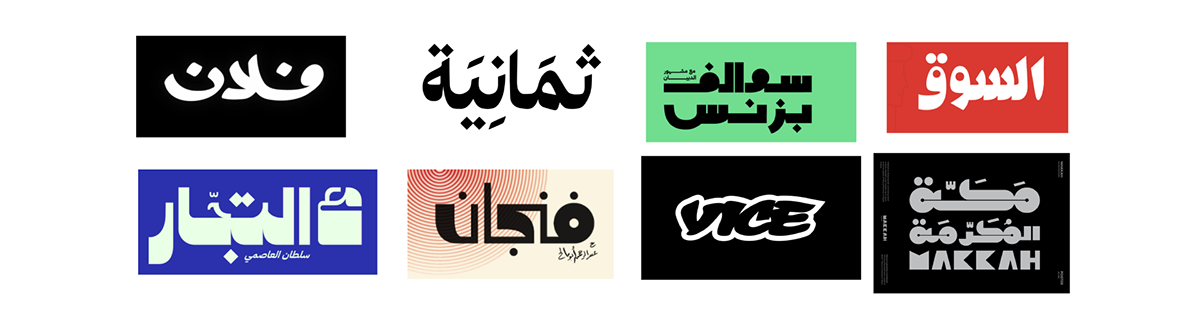
The goal was to craft an Arabic logotype, and I partnered with a calligrapher for this endeavor. Salah Aalouha was incredibly enthusiastic about assisting in sketching the word "Libra" in various styles, allowing us to select the most fitting one.

After settling on a more streamlined version, the subsequent phase involved vectorizing and refining the chosen design.

Additionally, we dedicated effort to arranging the three dots alongside the word "Libra," symbolizing the endless stories that Libra brings to its audience—one after another.
These dots will also serve as the iconic representation by which Libra will be recognized and associated.

In the final stages, we're wrapping up the logo design, ensuring every detail is refined and polished to represent Libra's essence and identity accurately.


We selected the 'Jali Arabic font' for its friendly yet professional vibe, closely resembling our logotype. It offers both readability and versatility. With a full range from extra light to extra bold, this font ensures flexibility and consistency in our design.
Find and get this font Here.
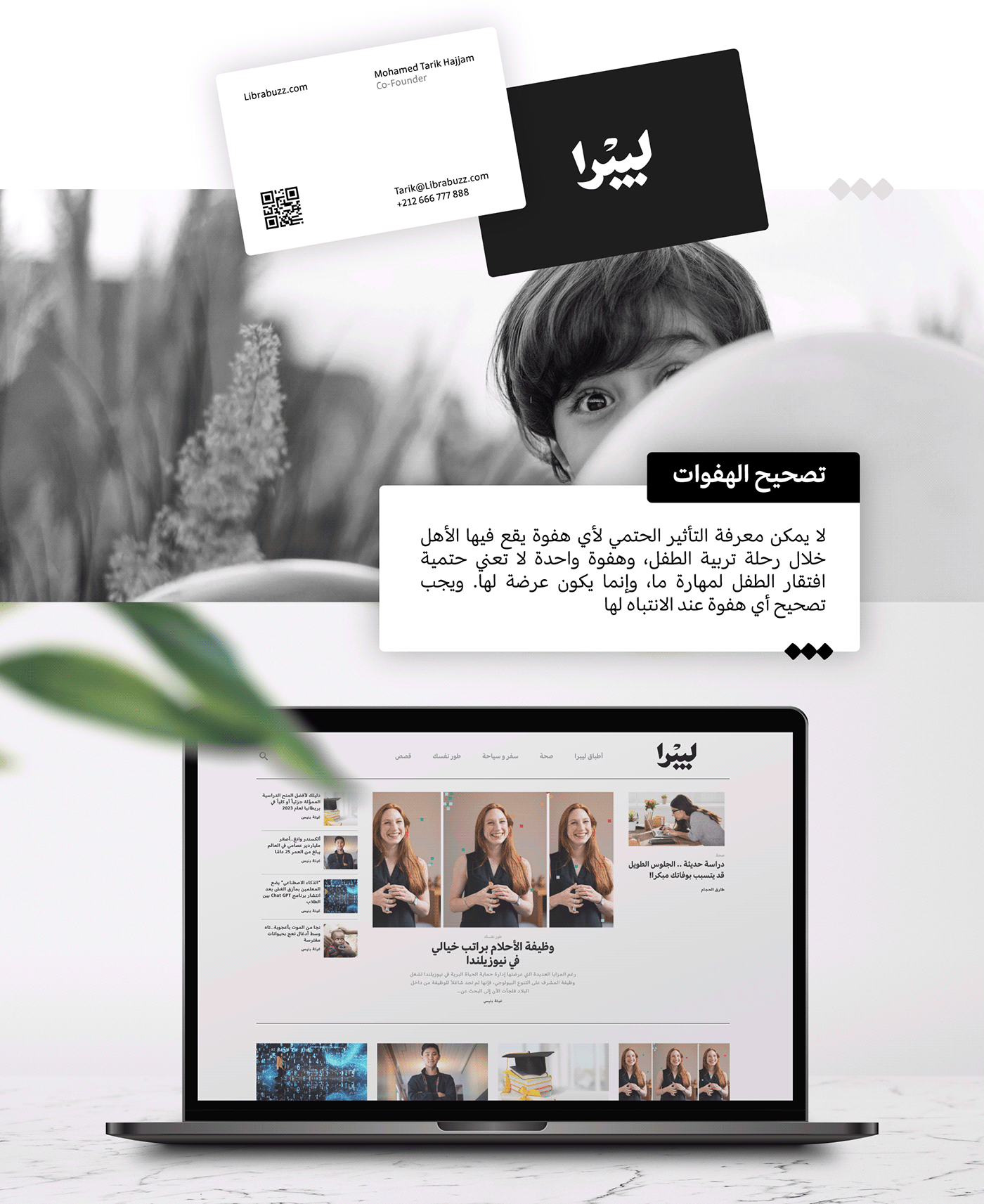
You can visit Libra's website here, www.librabuzz.com
along with all its social media platforms


Client: Mohamed Tarik Hajjam (Founder of Librabuzz)
Calligraphy sketches: Salah Alouha
Art Direction: Mohamed Belfqih AKA Belfeen
© 2023


